Color theory can feel overwhelming at first: so many terms, so many variables, and so much conflicting advice. But when we slow down and understand a few foundational ideas, color becomes far less mysterious.
Let’s start with the basics.
Color Theory 101: Understanding Color Relationships for Artists, Educators, and Designers
What are the three primary characteristics of Color?
Hue
Hue is the standard term for a color — red, yellow, blue, green, violet, and so on.
When we say “that’s a beautiful blue,” we’re talking about hue.
But hue alone doesn’t tell the whole story. Every hue has characteristics that affect how we perceive and use it.
Saturation/Brightness/Chroma
Saturation refers to a hue’s intensity relative to its own brightness.
Highly saturated colors appear vivid and strong.
Lower saturation colors appear softer, grayer, or more subdued.
As a color becomes lighter or darker, its saturation can shift as well. Many artists confuse saturation with brightness — but they are not the same thing.
Brightness (sometimes called chroma) is the absolute intensity of a color relative to white.
Unlike saturation, brightness remains constant across changes in lightness. It describes how strong or pure a color is at its core.
You can think of it this way:
- Saturation is about how intense a color appears.
- Chroma is about how inherently powerful the pigment is.
Depth or Value
Depth refers to how light or dark a color is.
This is one of the most important aspects of painting. Without strong relationships of color depth, even the most beautiful compositions fall flat.
Another term for depth is value. This refers to the greyscale where the depth of hue ranges from lightest to darkest, and is often assigned a numerical value, usually from 0 to 10. Since there are many more nuances of depth than what can be portrayed on a scale, artists and designers typically stick to the 0-10 scale as a basic reference.

Speaking of depth, another helpful concept to understand here is the natural order of hues.
The Natural Order
Hues follow a natural hierarchy of light to dark:
- Yellow and yellow-containing colors are the lightest in the spectrum.
- Tinted yellows are closest to white light.
- Violet and blue-heavy colors are the deepest.
- Pure violet sits closest to black in value.
This is why a bright yellow can appear luminous in a composition without any white added, while violet quickly deepens and darkens.
When you understand this order, your color choices become more intentional.
Color Interactions: How Colors Behave Together
Understanding individual colors is only half the story. The real magic happens when colors interact.
Primary Colors
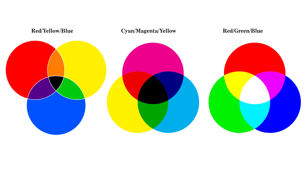
A triad of hues that can be combined to create all other hues of the rainbow. The two common triads of primary colors are:
- Red, yellow, and blue
- Cyan, magenta, and yellow
- Red, green, and blue (RGB) are used for the screens on electronic devices such as televisions, computers, and smartphones. These hues correspond to the cone cells in the human eye. Graphic designers primarily use RGB for strictly digital media.
Munsell’s Primaries are Red, Yellow, Green, Blue, and Purple (which is a five-primary system)
A Better Definition for Primary Colors
Artist and educator Ian Goldsmith offered the following definition or explanation for primary colors:
“A primary is less a ‘colour that can’t be mixed’ and more a clearly identifiable dividing point between neighbouring colours on the spectrum… in paint.”
I could not agree more!
Harmony
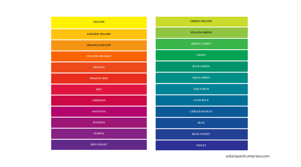
Harmony occurs when colors sit next to each other on the color wheel.
Examples:
- Blue, blue-violet, blue
- Yellow, orange, red
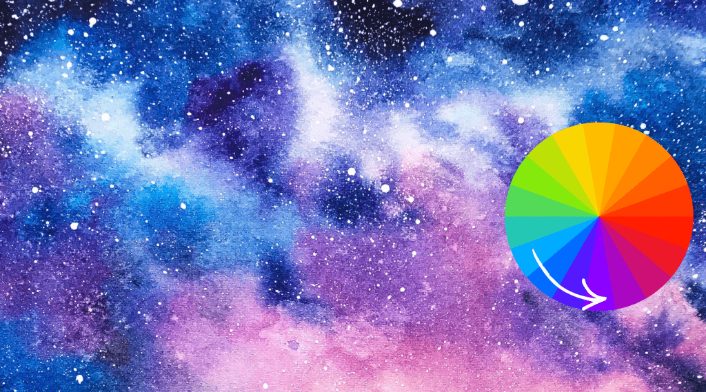
Because these hues are closely related, sharing an underlying hue such as yellow, red, or blue, they create calm, cohesive, simple relationships.
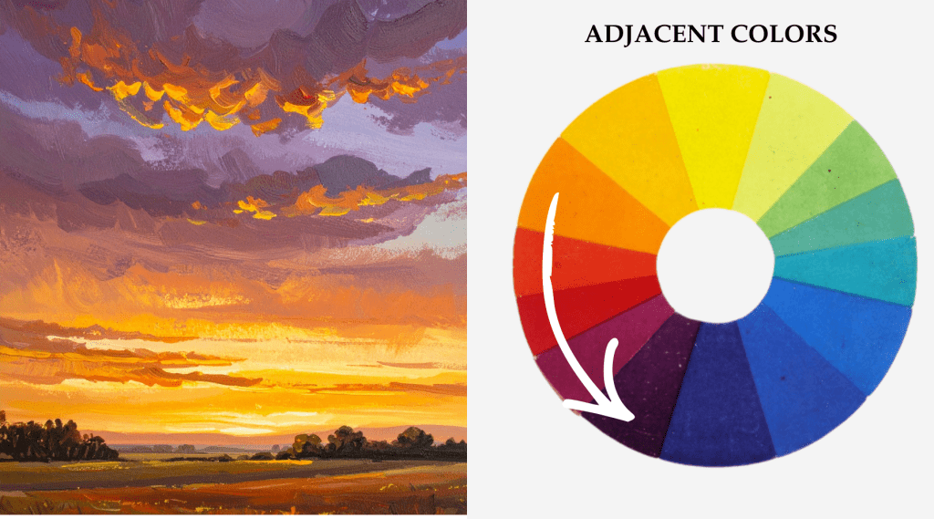
Adjacent color schemes are often:
- Easy to manage
- Naturally pleasing
- Excellent for beginners
Contrast
Contrast occurs when two colors from opposite sides of the color wheel are placed next to each other.
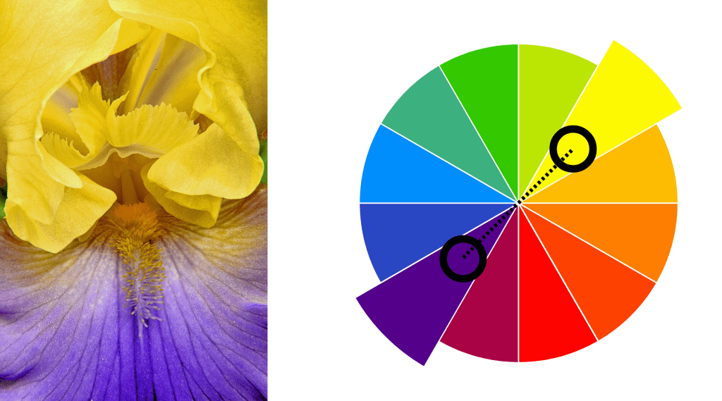
For example:
- Yellow and violet
When placed side by side, these colors enhance each other without causing a shift in hue. Each appears more intense because of the other. It is also interesting to note that the opposite color contains a primary hue the other is lacking; for example, orange contains yellow and red. Its complementary color is blue.
Contrast creates:
- Energy
- Visual tension
- Focus
Complementary Colors
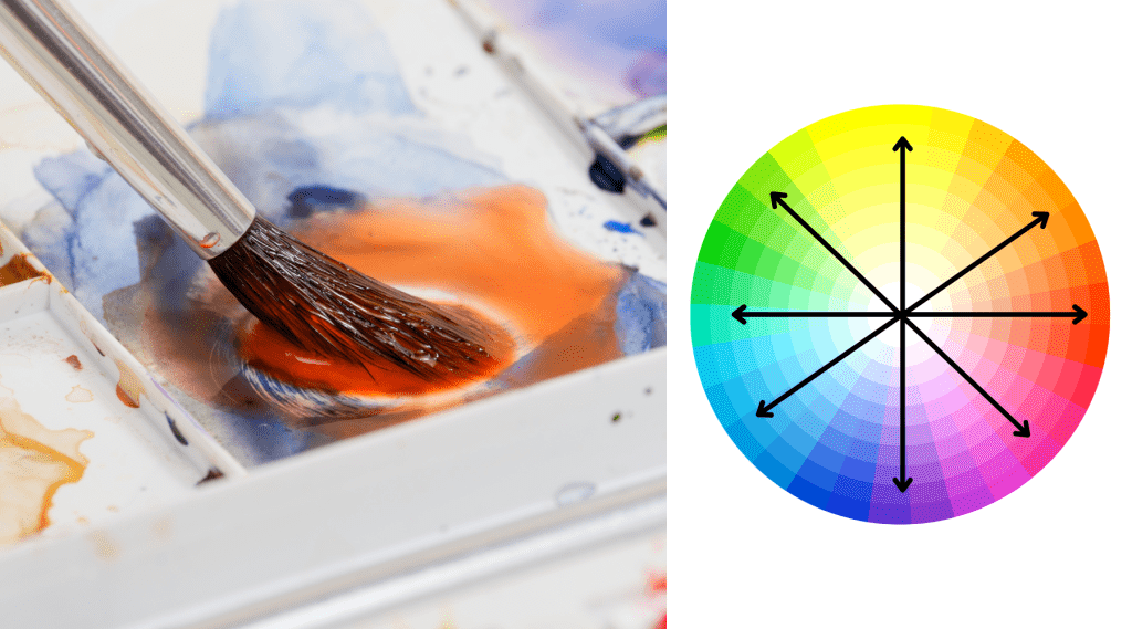
Complementary colors are hues directly opposite each other on the color wheel.
However, there is an important distinction:
When placed side by side, as contrasts, they intensify each other.
When mixed as physical pigments, they shift in hue.
For example:
- Mixing a small amount of Phthalo Blue into red results in a darker, more muted red.
- Complements often push each other toward gray.
- They create richer, earthier mixtures.
- Understanding complements prevents muddy color and gives you control over neutrals.
Color Bias
Most hues are not a neutral or pure color — they lean slightly toward red or blue on the color wheel. This is called color bias.
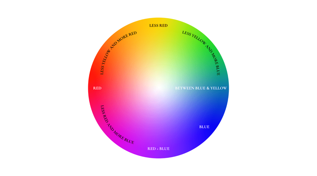
For example:
- Alizarin Crimson is a blue-biased red.
- Phthalo Green also carries a blue bias.
The thought process is that because they share a similar bias, they combine more harmoniously, producing deeper, richer, slightly earthy reds.
According to this theory, choosing the wrong bias can result in:
- Unwanted hue shifts
- Chalky mixtures
- Muddy color
- Understanding bias is one of the secrets to ideal color mixing.
In color mixing, it comes down to which hues you need to match and how you want your finished art piece to look. Some people have taken things such as color bias as dogma or endlessly argue over which set of primaries is the best (RYB vs CMY). At the end of the day, if your art turns out the way you want it to, that is all that matters. How you get there is up to you.
Color Temperature
Contrary to popular belief, color temperature is not an inherent property of color. It refers to how a hue feels — psychologically warm or cool.
Temperature is:
- Subjective
- Relative
- Dependent on what surrounds the color
For example, aqua blue feels warmer than cobalt blue — even though both sit in the “cool” family on the color wheel. Temperature is not fixed. It shifts depending on context.
A better example is looking at the sky. One could refer to a blue sky as “cool”. However, if it is 100°F/37 °C, would you still call it cool?

What about the brilliant sunset in this winter scene? While the colors consist of yellows, oranges, and reds, the temperatures in this landscape are clearly freezing.

So, in a literary sense, referring to colors as warm or cool is descriptive and, in the right context, can help elevate the writing. But, in art and design, it can be confusing. Which is why it is much more helpful to think in terms of colors’ actual characteristics – hue, saturation/brightness, and depth. However, color temperature does have its place…
Understanding color temperature helps you:
- Control mood
- Create ambiance
Final Thoughts
Color theory is not about memorizing rules — it’s about learning relationships.
When you understand:
- Hue
- Temperature
- Saturation
- Chroma
- Value
- Natural order
- Harmony and contrast
- Complementary mixing
- Color bias
You move from guessing… to intentional creation.
Color becomes less intimidating — and far more powerful.
Ready to Go Deeper?
Color theory is not meant to live in a textbook — it’s meant to be experienced and used.
If you’re an artist, I encourage you to take one concept from this post and experiment with it this week. Try creating a small painting centered on harmony. Or limit yourself to one complementary pair and explore value shifts. Growth happens in doing.
If you’re an art teacher, these concepts make for powerful classroom discussions. Invite students to compare temperature within a single hue, explore color bias through mixing exercises, or test how contrasts and complements behave side by side versus when blended. Even simple studies can dramatically sharpen visual understanding.
If you’re a homeschool parent, color theory offers a beautiful intersection of science and art. Studying light, pigment, perception, and emotion through color gives students both creative and analytical skills. A small set of primary paints and a color wheel can open an entire world of discovery.
Whether you’re teaching, learning, or refining your craft, understanding color relationships transforms how you see.
And when you begin to see differently, you begin to create differently.