In the study of color theory and color as it appears in the real world, it eventually becomes clear that colors are not arranged randomly. There are specific patterns and flows between the shifts in hue and how they interact with each other.
What is The Natural Order of Color?
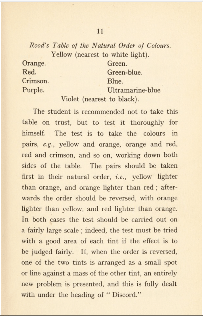
In his book, Suggestions for the Study of Colour, Henry Barrett Carpenter writes how colors follow a natural progression or hierarchy.
“It is Rood’s careful investigation that we owe the discovery of a sound basis on which to found a workable theory of colour. Deduced from the order of colours in the spectrum, Rood’s table of the natural order of colours is not a mere haphazard guess at the truth, for it stands the test of experiment.
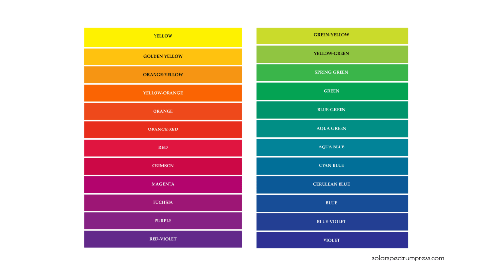
Briefly, this table indicates that yellow is the lightest of colours and violet the darkest, that one may travel between these extremes by two roads, i.e., by way of red, or by way of blue, and that the natural order is for orange to be deeper than yellow, red deeper than orange, and so on down to violet, while similarly, green is deeper than yellow, blue deeper than green, and violet deeper than blue.”
I’ve created modern versions of the chart mentioned above to help further demonstrate these concepts. In his book, Modern Chromatics, Ogden Rood refers to magenta as purple or purplish-red and cyan as green-blue, which is why Carpenter used those terms in his book as well.
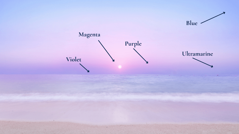
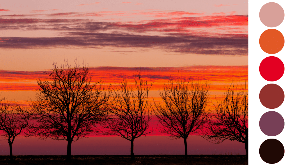
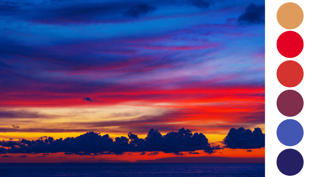
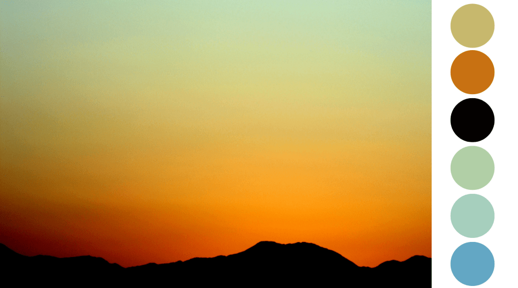
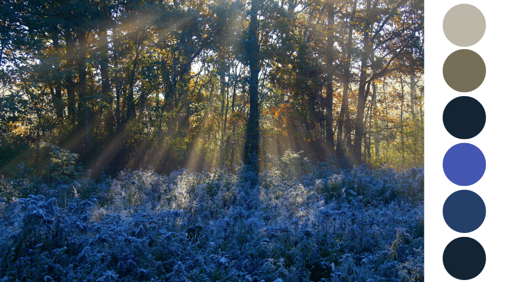
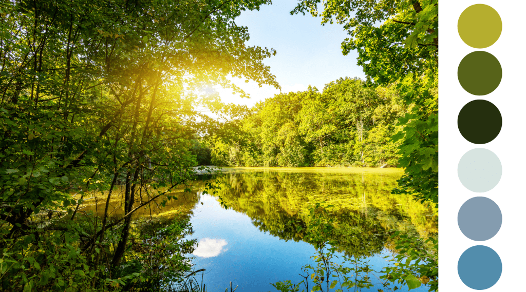
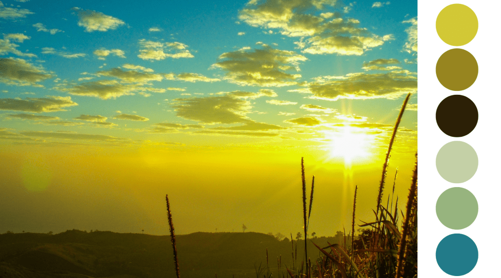
As stated above, this natural order isn’t just theoretical; you can observe it in the world around you. Watch a sunrise or sunset carefully. The colors shift and scatter, yet they still tend to fall within this larger value structure. Light-filled yellows, flaming orange and red hues rise visually, while deeper violets and blues settle lower in the scale.
The natural order as seen in a soft sunrise:
And the natural order as seen in a vivid sunset:
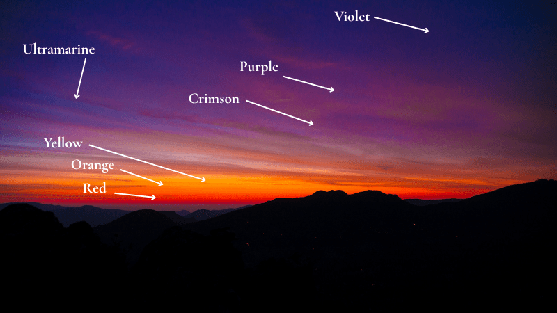
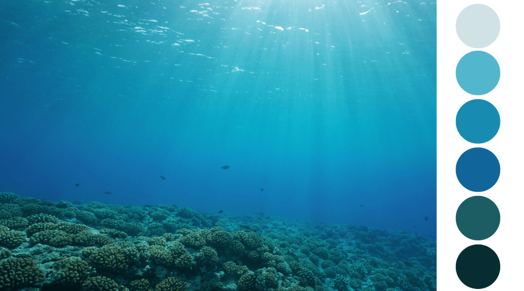
Even more examples of the Natural Order as found in nature:
The Natural Order of Color in Human Coloring
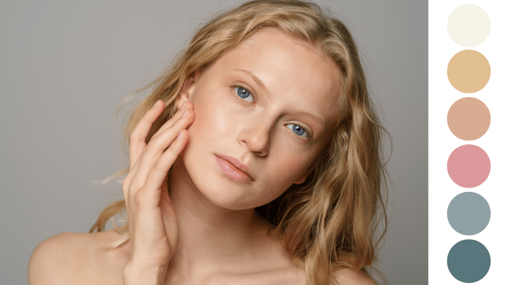
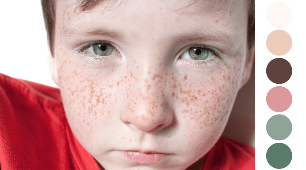
If you were asking yourself if the Natural Order of Color can be found in human coloring, the answer is yes! The main hues found in our skin and hair are yellow, red, brown, and black. Eyes can appear amber (yellow), brown (darkened yellow, orange, or red), green, blue, or hazel (a combination of yellows, oranges, greens, and blues). I found it fascinating to discover that blue eyes do not actually contain blue pigments. To learn how and why they appear blue, you can read more here.
And here are just a few examples of The Natural Order of Color as seen in humans:


How Can You Use The Natural Order of Color?
Learning this information took me from feeling overwhelmed and “What the heck am I looking at? Or where should I even start?” to “Ah! Now I see the purples and blues in those shadows and the yellows and oranges in those rays of sunlight!”
Understanding this progression changes how we approach harmony. When colors follow their natural order, compositions feel balanced and coherent. When that order is ignored, disharmony often appears, even if we can’t immediately explain why. The more you study color in nature, the more clearly this structure reveals itself.
Knowing how the colors flow and work together is so valuable and can assist you with breaking down the parts of what you are viewing. Landscapes, cityscapes, still lifes, and even portraits can feel staggering. But if you take a step back and view each part based on the hues in their natural value (depth) sequence, it all starts to make sense. You can then use that visual information to plan your color palette accordingly and tackle each area, one step at a time. How cool is that?
Planning Your Color Schemes Using The Natural Order
As I mentioned a moment ago, breaking down your visual references, whether they exist in a photograph or real life, is an extremely valuable first step. Fundamental steps like these are often the most overlooked or skipped entirely. My intention is not to be repetitive, pedantic, or Captain Obvious here. Haha!
Very colorful scenes or objects hit you with a lot of visual information all at once, which is why I am stressing the importance of taking the time to deconstruct what you see.
Here is an example of how you can put the Natural Order of Color into action for planning a landscape:
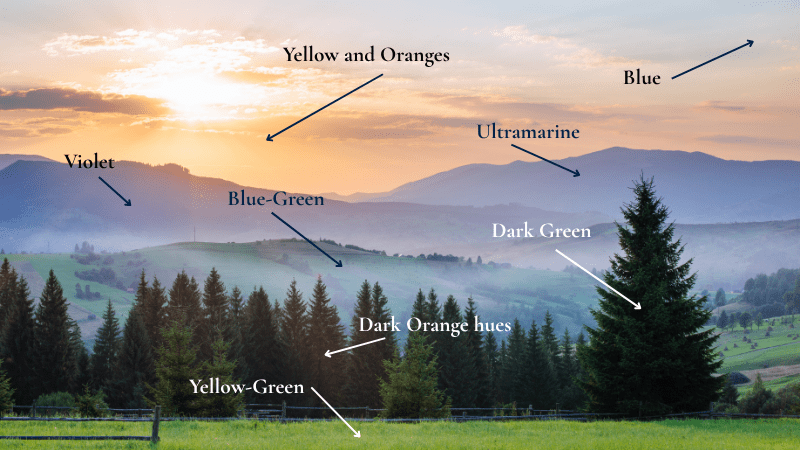
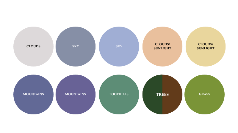
By identifying the color groups within this scene, it immediately feels less daunting. Now you can use this information as a guide for planning your color palette, which would look something like this…
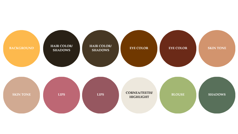
You can do the same with a portrait reference photo or model in real life:
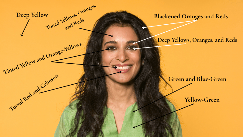
The palette would look something like this:
Closing Thoughts
Paying attention to the hues and their natural depth/value order can help you plan your color schemes, palette, and composition. Use this knowledge to your advantage to stave off visual overwhelm and confusion.
- Yellow-based colors are lighter (i.e., sunlight, fresh leaves or grass, unripe fruits, flowers, feathers, rocks)
- Oranges, Reds, and Greens are intermediate
- Blue/Violet-based hues are darker (think shadows, dark or ripe fruits, water, flower petals, birds, dark foliage, a night sky)
If you would like a reprinted copy of Henry Barrett Carpenter’s book, Suggestions for the Study of Colour, you can find the purchase information here.