I’ve been seeing artists asking on social media about how they can improve their color mixing skills and paint natural-looking skin tones. As a professional color consultant with 20-plus years of experience observing human coloring and as an artist, I feel qualified to answer these questions.
The first step toward painting realistic skin tones and mixing the right colors is knowing what you are seeing when you look at people. What hues are actually present in the skin? This information also applies to makeup artists, who paint directly on the skin using cosmetics.
Skin Tones Explained
Our skin tone is colored by two primary types of melanin, special proteins produced in the skin that provide pigmentation and natural sun protection. The first type is Pheomelanin and is yellow, red, or light brown.
The second type is Eumelanin, which is brown to black. The ratio of these two types of melanin is what determines our coloring. It is based on genetics and only changes with age.
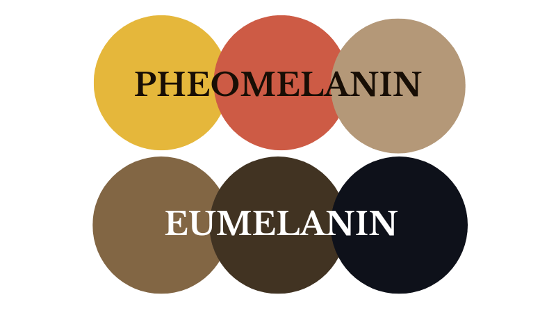
Our skin only contains these hues (yellow, red, brown, and black) and does not contain blue, green, or purple. Thinner areas of skin may appear to reflect these hues, but it is merely a trick of the light.
Our features can range from light to dark, and vivid to muted, and anywhere in between, regardless of ethnicity or race. Factors such as skin and hair thickness and texture all play a role in how our coloring is perceived.
Why are skin tones labeled as Cool, Warm, Neutral, and Olive?
This stems from older color systems that emphasize color temperature as a primary characteristic of color. It’s easy to remember, and cosmetic companies and fashion brands were able to incorporate it into their marketing. Let me help decipher this for you:
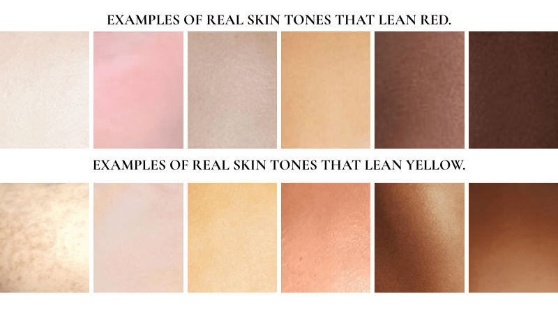
Cool = Pink/Red
Neutral = Beige (no obvious yellow or red tones)
Warm = Yellow/Golden, Peach, Orange
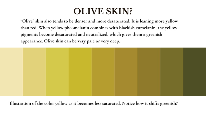
Olive = Desaturated Yellow (not green)
Is Color Temperature Important?
The short answer is no. I know these terms are everywhere, but the truth is, whether we perceive a color as cool or warm is purely psychological and relative. It is more important to focus on the hues present (red, yellow, brown) rather than something as subjective as color temperature. Color theorist and educator Peter Donahue further explains these concepts in the video below:
What About Undertone and Overtone?
Again, these are artificial terms that don’t accurately describe skin tones. What you see on the surface of your skin is its pigmentation, and that’s it. If your skin is thinner in one area, the tiny blood vessels that run throughout may make that area more visibly pink or red, but that’s not an undertone, just as a summer tan is not an overtone. The melanin that was already there got activated due to overexposure. It’s your body’s way of telling you it is getting too much UV radiation and is now trying to protect itself. These are terms used widely throughout the beauty industry that I wish would die. Haha!
Best Paint Colors for Mixing Skin Tones
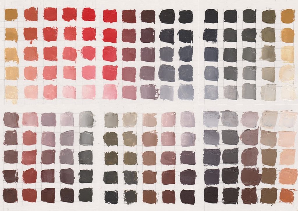
Now that you know why our skin looks the way it does, you can easily mimic it by mixing the following paint pigments:
- PY42 Yellow Ochre
- PR106 Vermilion, PR108 Cadmium Red, or PR264 Pyrrole Rubine
- Ivory Black, PBK11 Carbon Black, or PBk7 Mars Black (or a combination)
- PW6 Titanium White
- PBr7 Raw Umber and Burnt Umber are also good additions to this limited palette.
A limited color palette such as this is often referred to as a Zorn palette, after Swedish portrait artist Anders Zorn (18 February 1860 – 22 August 1920), who famously used these colors. While he certainly wasn’t the first to use this selection of hues, his influence, as well as that of painters such as Titian and Rembrandt, remains strong. Since these happen to be the very hues found in the skin, it makes perfect sense.
Of course, you can mix greens, blues, and violets into your yellows, oranges, and reds to achieve similar results, but why not paint what is actually there?